Kickgoing
킥고잉
Brand Identity
-
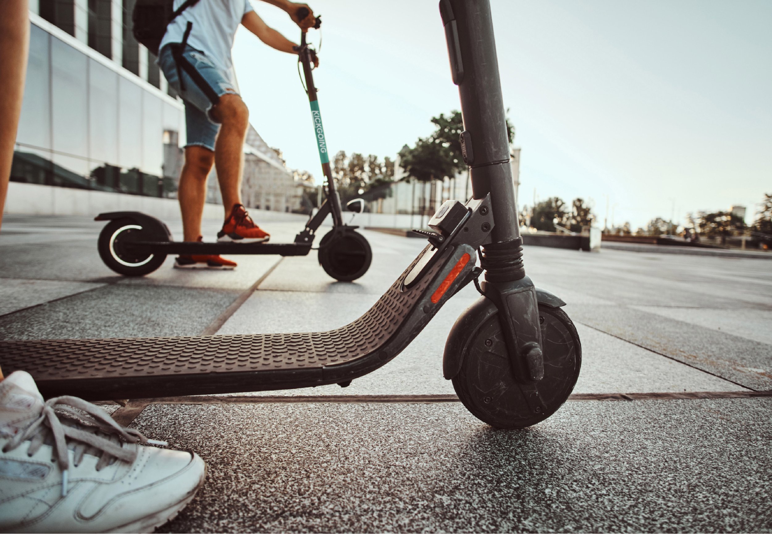
Do you remember those times when you faced a distance that was too far to walk but too close for public transportation? That's when "Kickgoing" comes in, the popular choice these days. In just a year and six months since its launch, Kickgoing has been steadily growing as the leading electric kickboard sharing service brand, transforming the urban landscape and the way we move."Leading, Safe & Trust"
The brand identity renewal was conducted to firmly establish Kickgoing as the number one brand in the market and to further progress as a safe and trustworthy brand. The brand logo of Kickgoing symbolizes the image of Kickgoing drivers enjoying smooth rides through the city on electric kickboards."Enjoy your move"
The typography with flowing curves and the striped element at the bottom represent the safe and enjoyable experience of riding Kickgoing's smooth kickboards. The new identity aims to support Kickgoing's continued journey as a mobility brand that connects people and spaces.—
걸어가기에는 멀고, 대중교통 타기에는 가깝고 애매한 거리. 어떻게 갈까 고민했던 기억 다들 있으시죠? 그럴 때 요즘 하는 선택, ‘킥고잉’입니다. 킥고잉은 출시 1년 6개월 만에 도시와 이동의 풍경을 바꾸며 국내 1위 전동킥보드 공유서비스 브랜드로 꾸준히 성장하고 있습니다.“Leading, Safe & Trust”
브랜드 아이덴티티 리뉴얼은 시장 내 1위 브랜드로 리더십을 공고히 하고, 안전하고 신뢰할 수 있는 브랜드로 다시 한번 나아가기 위해 진행되었습니다. 킥고잉의 브랜드 로고는 전동 킥보드로 도심을 막힘없이 질주하며(Onward) 드라이빙을 즐기는 킥고잉 드라이버의 모습을 상징합니다.“Enjoy your move”
유연한 곡선을 가진 타이포그래피와 하단의 스트라이프는 부드러운 주행으로 안전하게 즐기는 킥고잉의 모습을 담아 일러스트 가이드에도 적용하였습니다. 새로운 아이덴티티를 시작으로 사람과 공간을 연결하는 모빌리티 브랜드로 계속해서 나아가기를 응원하겠습니다.
To find out more for KICKGOING
or any of our other brands, get in touch